Compressed Value Underpainting
Below is an under paintings executed in “en camaïeu”. The phrase “en camaïeu” basically differs from “grisaille” or grey monochrome painting by the addition of a single color. Think of “Grisaille” as being mainly concerned with value (lights and darks), where “camaïeu” painting involves the third element of temperature. The colors I most often use for this sort of underpainting are Raw Sienna, Raw Umber, and White. They dry rapidly and I like the overall warmth they produce. I use a number of different palettes depending on what I’m doing, but the one that gets the most use when I’m in the comfort of my studio is this glass one, backed by a 7 whole tone and 13 half tone value scale.
This style of under-painting is all opaque, the transparencies are part of the over painting process. Transparency is a great asset to the medium, but I find it very freeing to disregard transparency at the initial phase of a painting. This allows me to adjust the drawing without worrying about losing “my precious” transparency in the shadow mass. It is of utmost importance that the dominant color for the shadow mass be of a light value. In this case, Raw Sienna falls at value 5 in the upper range of the value scale. This is generally the darkest value in the under-painting, with the darkest Raw Umber value tinted to this value, if not a quarter step darker. The light mass is painted in heavy impasto with tints of Raw Umber as well as tints of warm and cool intermixtures of Raw Umber and Raw Sienna. The finished under-painting is a very blond version of the finished design, with the darks unified into a single field and the lights pushed up into the uncomfortably bright register. You could refer to it as an opaque approach to “Chiaroscuro“.
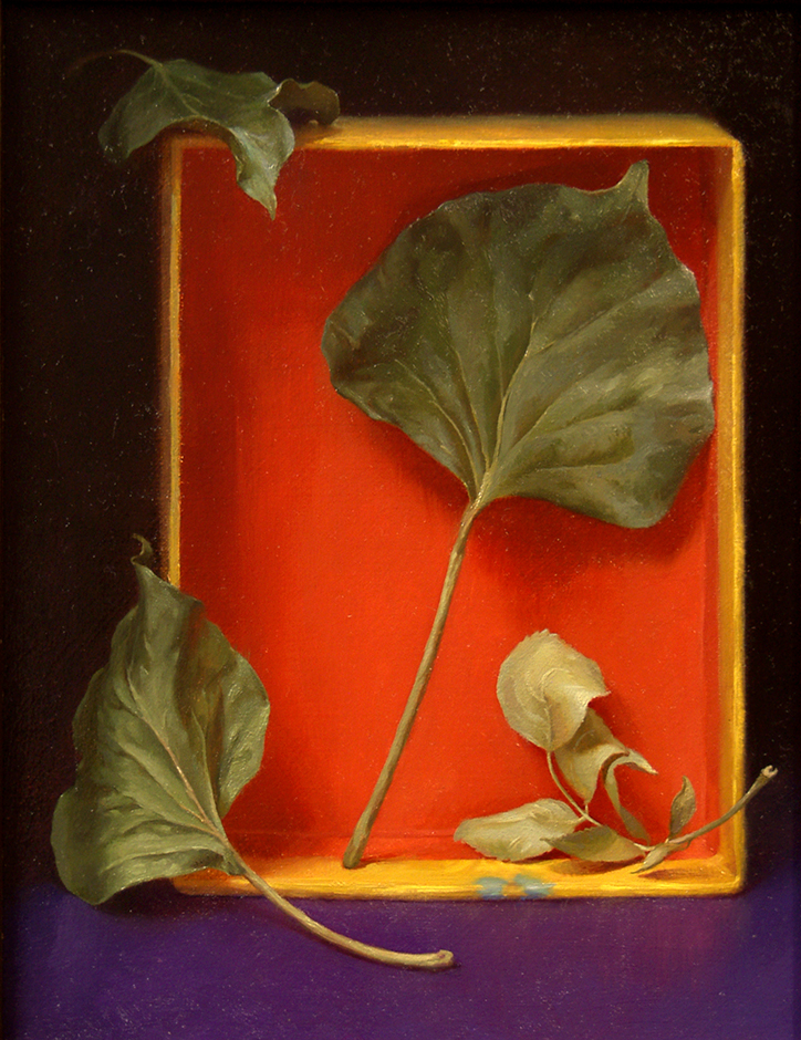
The Completed Painting, Fallen Leaves, 9 x 7 Inches
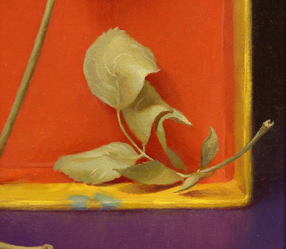
The purpose of this stage is to build up weight and texture in the surface of the painting while dividing the light mass from the shadow mass. I’m setting up the chromatic shifts that will occur in subsequent layers while simplifying drawing and building surface quality. I find that if I’m less worried about specificity in color mixtures I can manipulate the paint texture more freely. This is something that I picked up from that Spanish rascal Ribera and his transcendent handling of flesh. I want the actual light that strikes the surface of the painting to read more strongly and robustly in the light mass areas. So while the entire under-painting is addressed opaquely the shadow mass is kept thin. You can see this effect at work in the detail of the finished painting below. Note the thickness of the paint of the leaf as it overlaps the edge of the box. In a way, its not that much different than making a very low relief sculpture.
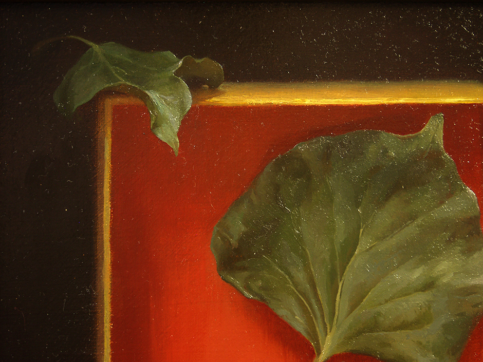
Once I am satisfied with the under-painting and its fully dry, over-painting commences with the first of several transparent glazes. I must say, I love working into a wet glaze as much as Captain Kilgore “loves the smell of napalm in the morning”! (If you haven’t seen Apocalypse Now, I’m sorry, but basically, it “Smells like victory!”.) As I paint into the “couch” of transparent color the edges of strokes soften and blend into the transparent passages. Its subtle, but it would take days and many tiny brush strokes to achieve those delicate transitions opaquely. The more one can achieve without explicitly mixing and applying the better. This is a principle that Dalí referred to as “the painter’s laziness”, embrace it as a discipline. Keep all things as simple as possible, do as little as necessary. You can see some of these effects in the details below, paying close attention to the areas where the opaque light mass meets the transparent shadow mass. In some passages, the darks are not even that far from a single glaze whispered over the under-painting.